This is a CSS tutorial to draw concentric circles using pure CSS. Here Web Developer Mr Choudhury shown with free source code examples, the easiest ways to draw CSS circles & concentric circles with the help of pure CSS. Here DIV represent each circle having border-radius:50%;.
About this tutorial & author : Also Mr. Choudhury shown the formula, and he described and explained here developed by the renowned CSS layout expert and css template designer for web page layouts.
- Formula to draw CSS concentric circles
- Tutorial Part 1- draw two concentric circle using CSS3
- Part 2- draw 3 CSS3 Concentric Circles
- Basic rule to draw CSS concentric circles
The formula to draw two concentric circles in CSS:
1. Define WIDTH/HEIGHT of outer most circle, Here outer most DIV’s width / height is same as 400px.
2. Outer DIV POSITION:RELATIVE. Define inner DIV POSITION : RELATIVE.
3. Make the BORDER-RADIUS : 50% of each DIV representing the circles, i.e inner and outer DIV.
4. The rule is that if you set the TOP / LEFT property of this inner DIV as Y unit, then width/height of this inner DIV should be = (100-2Y)%.
5. EXAMPLE : If you position inner DIV by setting up stylesheet code TOP:5% , LEFT:5%, (here outer DIV contains inner DIV) then WIDTH/HEIGHT of this inner DIV should be of 90% of parent “outer DIV”. In stylesheet for inner DIV you have to write WIDTH:90%
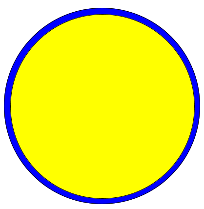
Part 1- draw two concentric circles (CSS)
Using CSS draw two concentric circles, inner circle can be placed anywhere inside outer circle. You shall get the explanation to draw it yourself anywhere. And also Mr Choudhury, the CSS guru describes the formula behind the drawing. View the output.
Just below the image, we have described a generalized formula to draw concentric circles in CSS. You are free to use this formula for your site. This is the first tutorial of this series of tutorials to draw circles and concentric circles using CSS.
Basic CSS rules to draw concentric circles
- Define width/height of outer most circle, that’s actually a DIV having border-radius : 50%. Here outer most div’s width / height is same as 400px. You can take any width in pixel or % value.
- Just inner circle inside outer circle should be of position:relative.
- Outer DIV(circle) position may be relative or absolute according to your need. I have defined outer circle’s positioning property as position:relative.
- But the main decisive factor is TOP and LEFT property and width/ height. The rule is : the if you use top / left property of this relatively positioned inner DIV as y unit in pixel (px) or %, then width/height of this inner DIV must be = (100-2y)%.
- Define outer DIV width / height as 400px. Position should be relative.
- Define inner DIV position : relative. If you position it by – top:5% , left:5%, then width/height of this inner DIV should be of 90% of parent DIV.
Part- A : Two concentric circles. Inner circle may have any radius within the outer DIV

HTML Code :
<div class=”outer circle shapeborder”>
<div class=”inner circle shapeborder”> </div>
</div>
Style Sheet :
<style>
.shapeborder { border:1px solid black; }
.circle { border-radius: 50%; }
.outer {
background-color:blue;
width:400px;
height:400px;
position:relative;
}
.inner {
background-color:yellow;
top: 3%; left:3%;
width:94%;
height:94%;
position: relative;
}
</style>
Part – B: Draw Two Concentric Circles, Inner Circle Exactly Centered
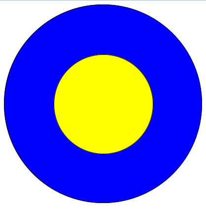
Before going through the following codes I highly suggest you to go through the section in this article : Basic CSS rules to draw concentric circles
StyleSheet Code:
<style>
.outer {
background-color:blue;
width:400px; /* You can define it by % also */
height:400px; /* You can define it by % also */
position:relative;
border:1px solid black;
border-radius: 50%;
}
.inner {
background-color:yellow;
top: 25%; left:25%; /* of the container */
width:50%; /* of the container */
height:50%; /* of the container */
position: relative;
border:1px solid black;
border-radius: 50%;
}
</style>
HTML Code :
<div class=”outer”>
<div class=”inner”> </div>
</div>
Read Next tutorial – Three HTML DIVs as 3 concentric circles CSS
-
If you want to learn Web designing & CSS visit this link – web designing courses in Kolkata
-
For top search engine ranking in Google know the search engine optimization service cost
-
For top class web designing service & php web development Java JSP PHP Developer and Web Designer
Tutorial Part 2 – draw three concentric circles using css
Using CSS draw 3 concentric circles, where middle circle is in equal distance from outer circle and inner circle. Here innermost circle may have any radius. View the output.
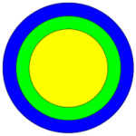
This is a CSS tutorial to draw three concentric circles, middle circle is placed just at the middle of the outermost and innermost circles, where innermost circle may have any radius, which should be less than the outermost circle.
Prior reading this tutorial go through the Part A & Part B of this tutorial.
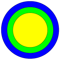
Description of this tutorial (View the Output): Here I have drawn 3 circles using CSS. The middle circle is exactly centered between the outermost and innermost circle. In other words the
RADIUS OF THE MIDDLE CIRCLE = (OUTER CIRCLE RADIUS + INNER CIRCLE RADIUS) / 2.
Here each circles has been represented by a DIV.
This tutorial is someway different than the other previous tutorials. Here inner circles INNER-1 and INNER-2 DIV are inside same parent OUTER-1 DIV. Inner two div’s, INNER-1 and INNER-2 DIV have position property ABSOLUTE
<div class=”outer-1″>
<div class=”inner-1″>
</div>
<div class=”inner-2″>
</div>
</div>
<style>
.outer-1 {
background-color:blue;
width:400px; /* You can define it by % also */
height:400px; /* You can define it by % also*/
position:relative;
border:1px solid black;
border-radius: 50%;
}
.inner-1 {
background-color:lime;
top: 10%; left:10%; /* of the container */
width:80%; /* of the outer-1 */
height:80%; /* of the outer-1 */
position: absolute;
border:1px solid black;
border-radius: 50%;
}
.inner-2 {
background-color:yellow;
top: 20%; left:20%; /* of the container */
width:60%; /* of the inner-1 */
height:60%; /* of the inner-1 */
position: absolute;
border:1px solid black;
border-radius: 50%;
}
</style>